Logo that’s quite a change from what you might normally see in the mental health field. This psychologist has a “whole person” approach which is reflected in this logo and my design of her web site.
Logo that’s quite a change from what you might normally see in the mental health field. This psychologist has a “whole person” approach which is reflected in this logo and my design of her web site.
This logo was converted from a static image to an animated logo for client’s web site.
Logo created for a team building consultant.
This logo was for a shoe store offering work and play footwear.
Camp Eaton has been my client since approximately 1990. During this nearly twenty-five-year relationship, the property has evolved from an overnight campground to a seasonal summer residence for individuals from New England and well beyond. An exploration of the evolution of this logo since my involvement with the property in 1992 may be VIEWED HERE.
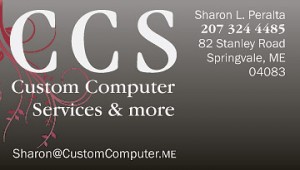
Creating a softer appearance for hard-edged services. This female computer technician, working in a male-dominated industry, wanted a blend of feminine and masculine in her company branding.
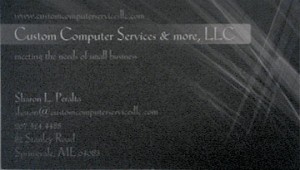
Below is a before (left) and after (right) image of owner, Sharon Peralta’s, business card:
![]()
Holly Morrison approached me early in 2020 to create a consistent brand for her family-run Café, situated in my home town of Wells, Maine. Here is the RANGE OF CONCEPTS that were presented. Holly asked me to take the logo with the raspberries and blueberries and expand with more fruit. I love the final outcome with the interplay of the type and fruit!
![]()
This logo was designed for an innovative entrepreneur who went up against Cape Code Potato Chips. The company was successful (see bag design). This start-up company was later purchased by a multi-national food company.
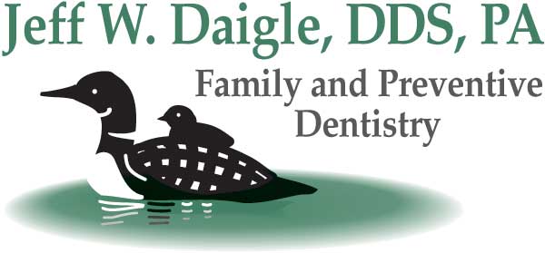
Jeff had a vision for his branding … he wanted to use a loon in his logo. This vector-based image was designed to allow only two colors of ink in printing office materials. I believe this was created in the early 90s and I feel it remains contemporary today.
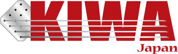
This logo was produced for the US affiliate of a Japanese coating-to-metal company.
Fun graphic shapes from name initials. This graphic is a flash animation.