This is a billboard ad which was designed to go on public transportation in a small Maine city. This was a very different approach to advertising chiropractic services in this area.

This is a billboard ad which was designed to go on public transportation in a small Maine city. This was a very different approach to advertising chiropractic services in this area.
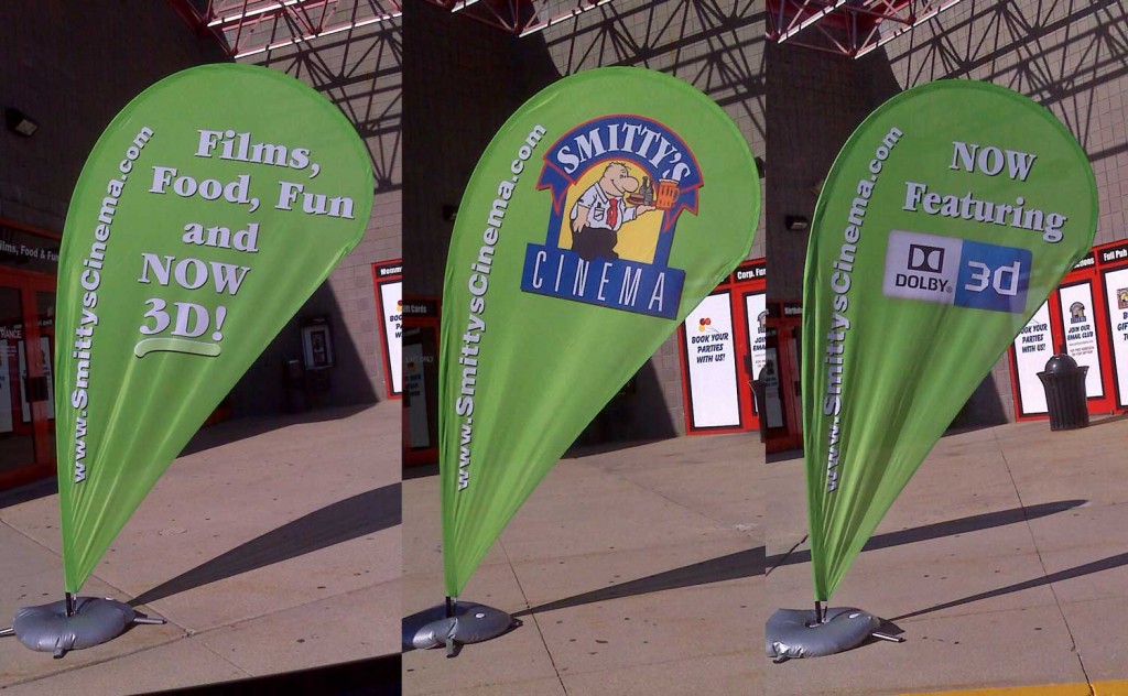
These three free-standing banners were designed for a local movie theater.
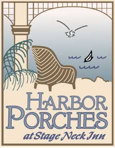
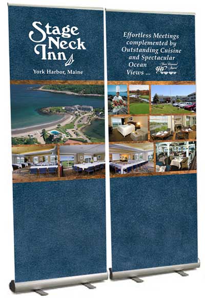
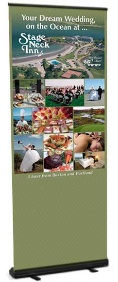
These are three pop-up display stands created for Stage Neck Inn. Two are for conference business and are designed so that if there is limited space, only one may be used. The other is a display for wedding shows.
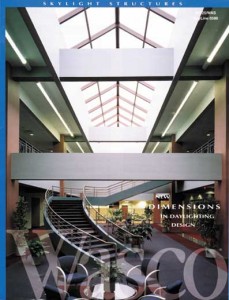
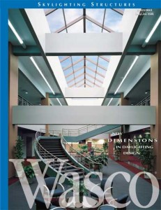
This is a company that manufactures skylights. Apparently the shot of this large skylight in a mall was taken on an overcast day. However, the then-agency decided to use the image as is. When I was retained to redesign the catalog interior I asked if I could add a sky to the skylight so that it would be more prominent. I also fixed color issues due to the florescent lights and increased the contrast of “Wasco” on the piece so it was more prominent.
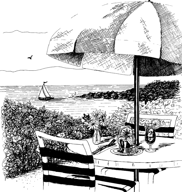
Pen and ink illustration done for local dining ad series for Stage Neck Inn.

Zoom-in of detail in artwork for Wild Kitty Cat Food.
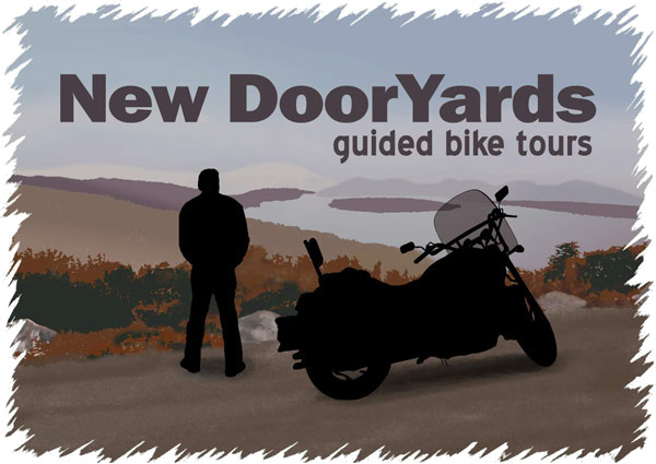
This illustration/graphic was drawn from a photo. It is digital and can be resized greatly.

Logo that’s quite a change from what you might normally see in the mental health field. This psychologist has a “whole person” approach which is reflected in this logo and my design of her web site.
This logo was converted from a static image to an animated logo for client’s web site.
Logo created for a team building consultant.
This logo was for a shoe store offering work and play footwear.

Camp Eaton has been my client since approximately 1990. During this nearly twenty-five-year relationship, the property has evolved from an overnight campground to a seasonal summer residence for individuals from New England and well beyond. An exploration of the evolution of this logo since my involvement with the property in 1992 may be VIEWED HERE.

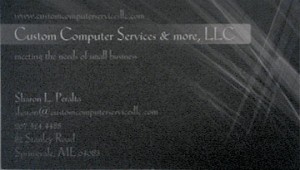
Creating a softer appearance for hard-edged services. This female computer technician, working in a male-dominated industry, wanted a blend of feminine and masculine in her company branding.
Below is a before (left) and after (right) image of owner, Sharon Peralta’s, business card: